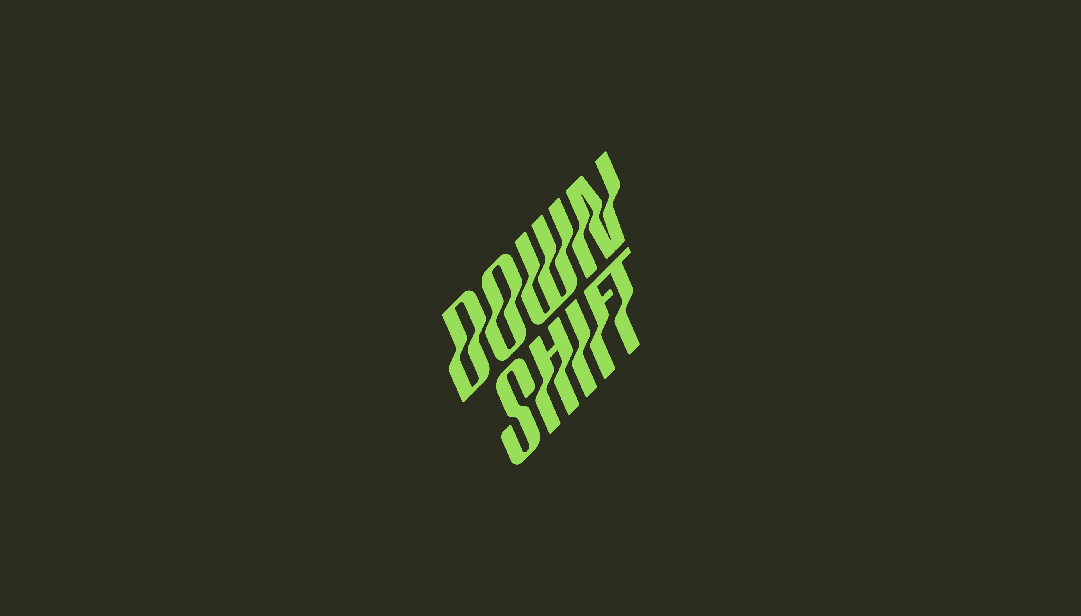
Down Shift
We partnered with the founders of Down Shift to take their Cannabis-infused sparkling beverage company from 0-1. As more consumers are moving away from alcohol consumption, the cannabis beverage market is rapidly expanding. The team needed a distinctive identity that could stand apart from a sea of sterile health-drink competitors and overly psychedelic cannabis brands. They hired us to create a professional, holistic brand and packaging system that embraced nature and promotes an active lifestyle.


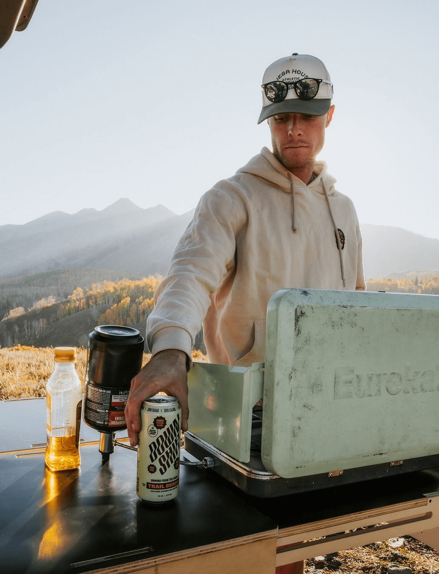
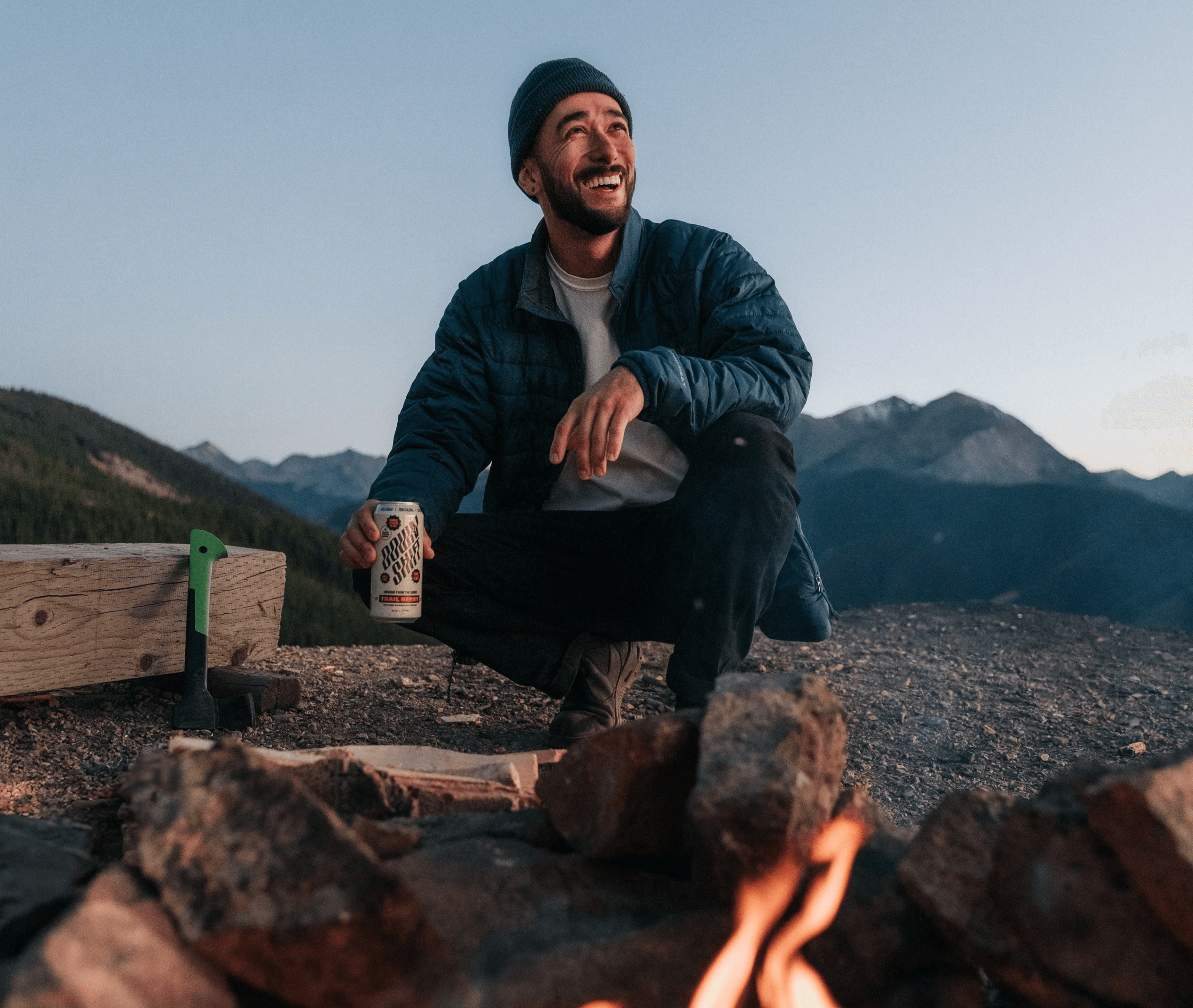
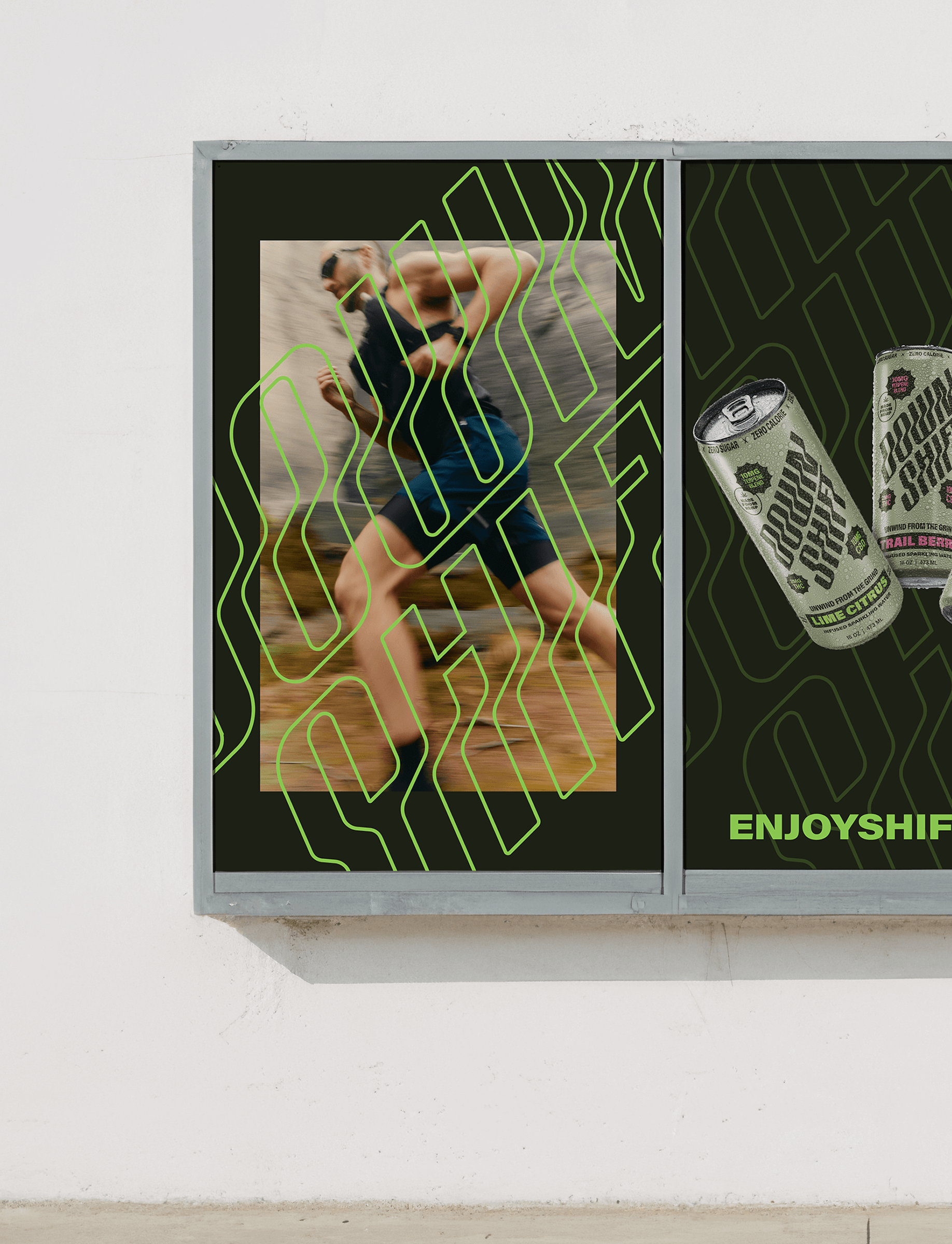
Unwind from the grind, with Down Shift.
The team's purpose is to seamlessly integrate the richness of nature into daily life. They're committed to harnessing a spectrum of natural, unaltered plant compounds, including plant-based terpenes, crafting products that not only enhance well-being but also elevate everyday experiences. Our mission was to develop a brand platform that demonstrated that ethos.

When we decided to start this company, we knew exactly who to call to lead the design of our brand. There was no second option for us. We were going to work with Idol 100%.

KS&CO
Creative Direction, Visual Identity Design, Packaging
Down Shift
We partnered with the founders of Down Shift to take their Cannabis-infused sparkling beverage company from 0-1. As more consumers are moving away from alcohol consumption, the cannabis beverage market is rapidly expanding. The team needed a distinctive identity that could stand apart from a sea of sterile health-drink competitors and overly psychedelic cannabis brands. They hired us to create a professional, holistic brand and packaging system that embraced nature and promotes an active lifestyle.
Challenge
Take an early concept for a new Cannabis beverage and take it from 0-1 with a successful launch to market.
Approach + Solution
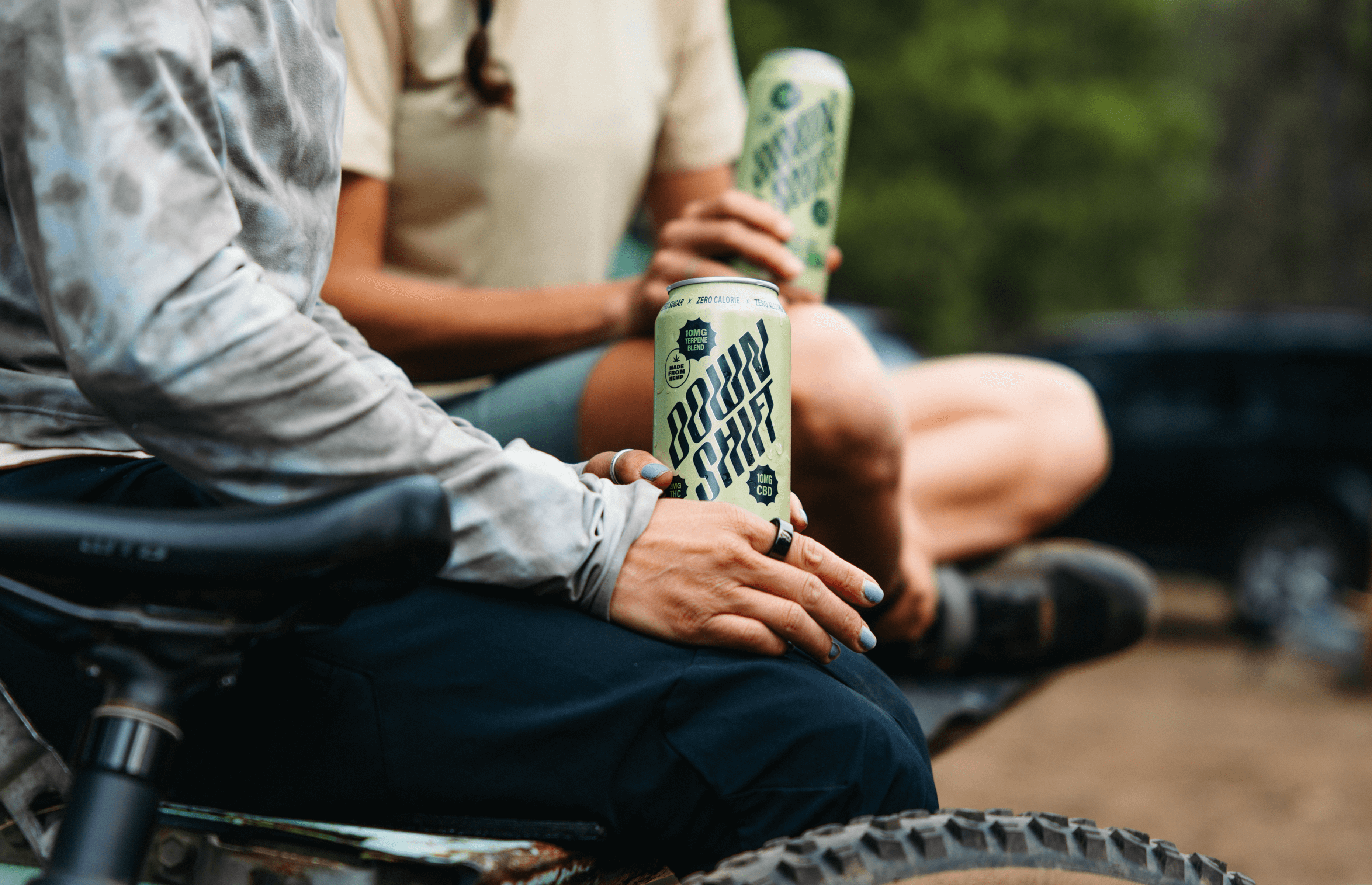
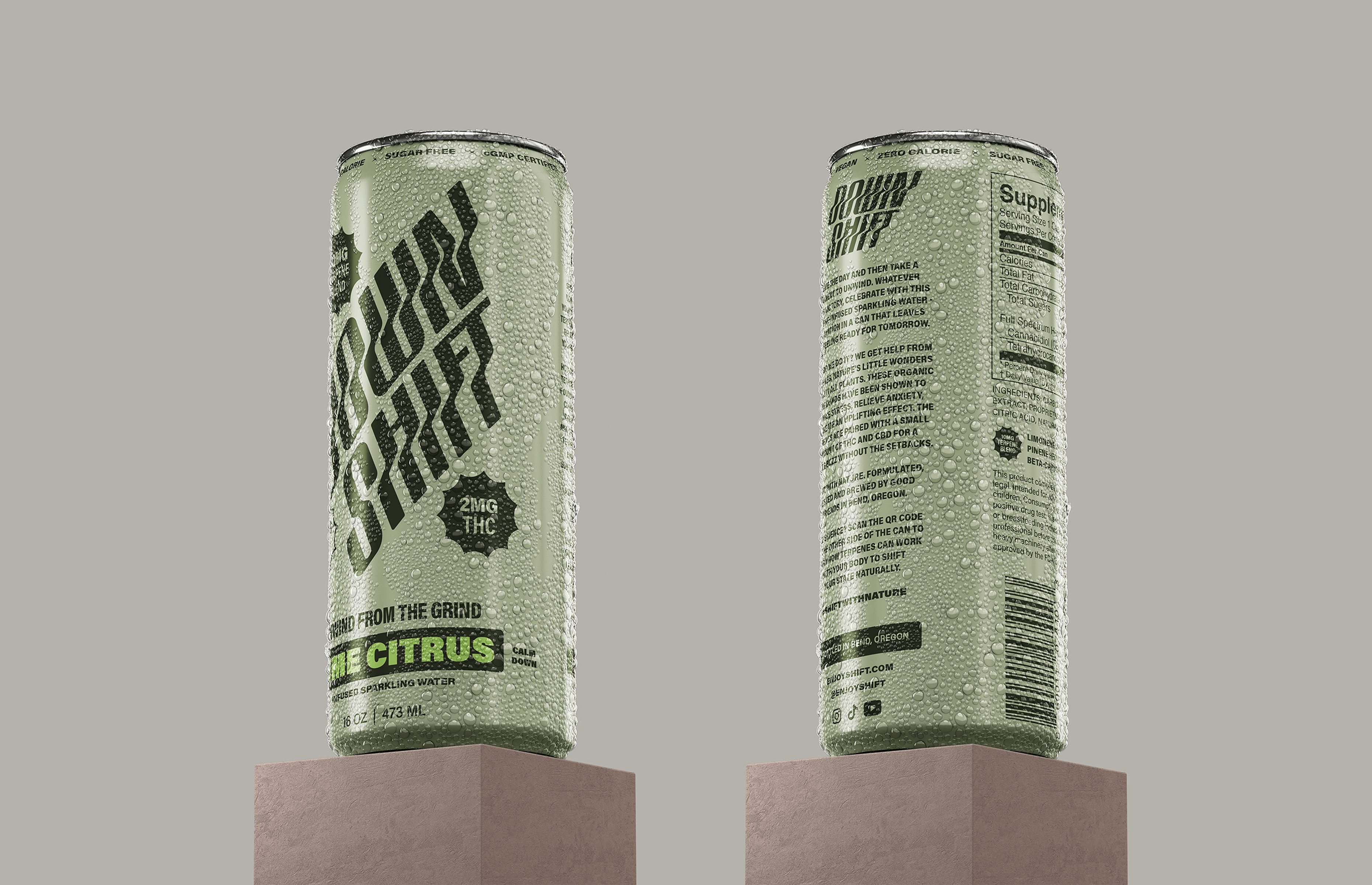
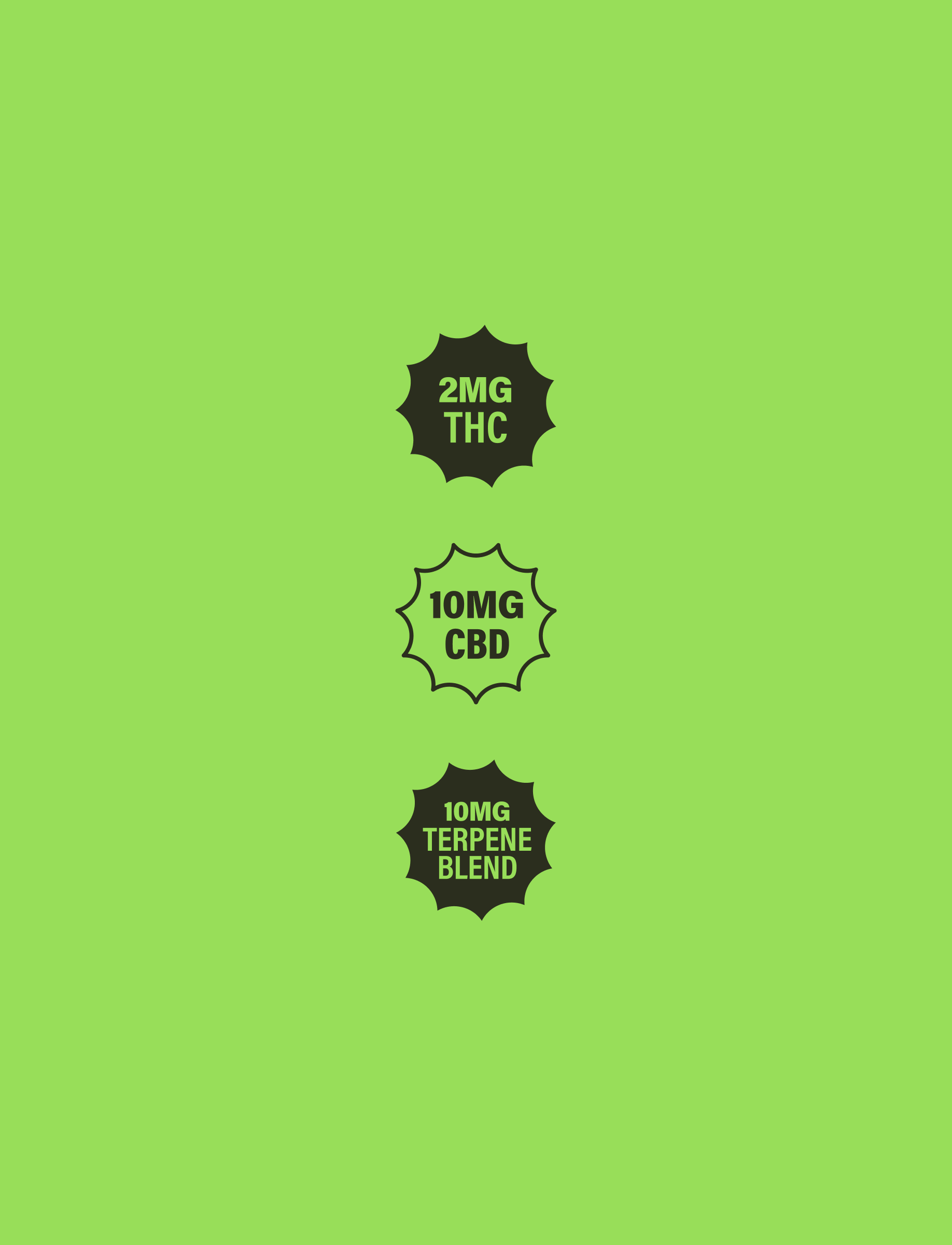
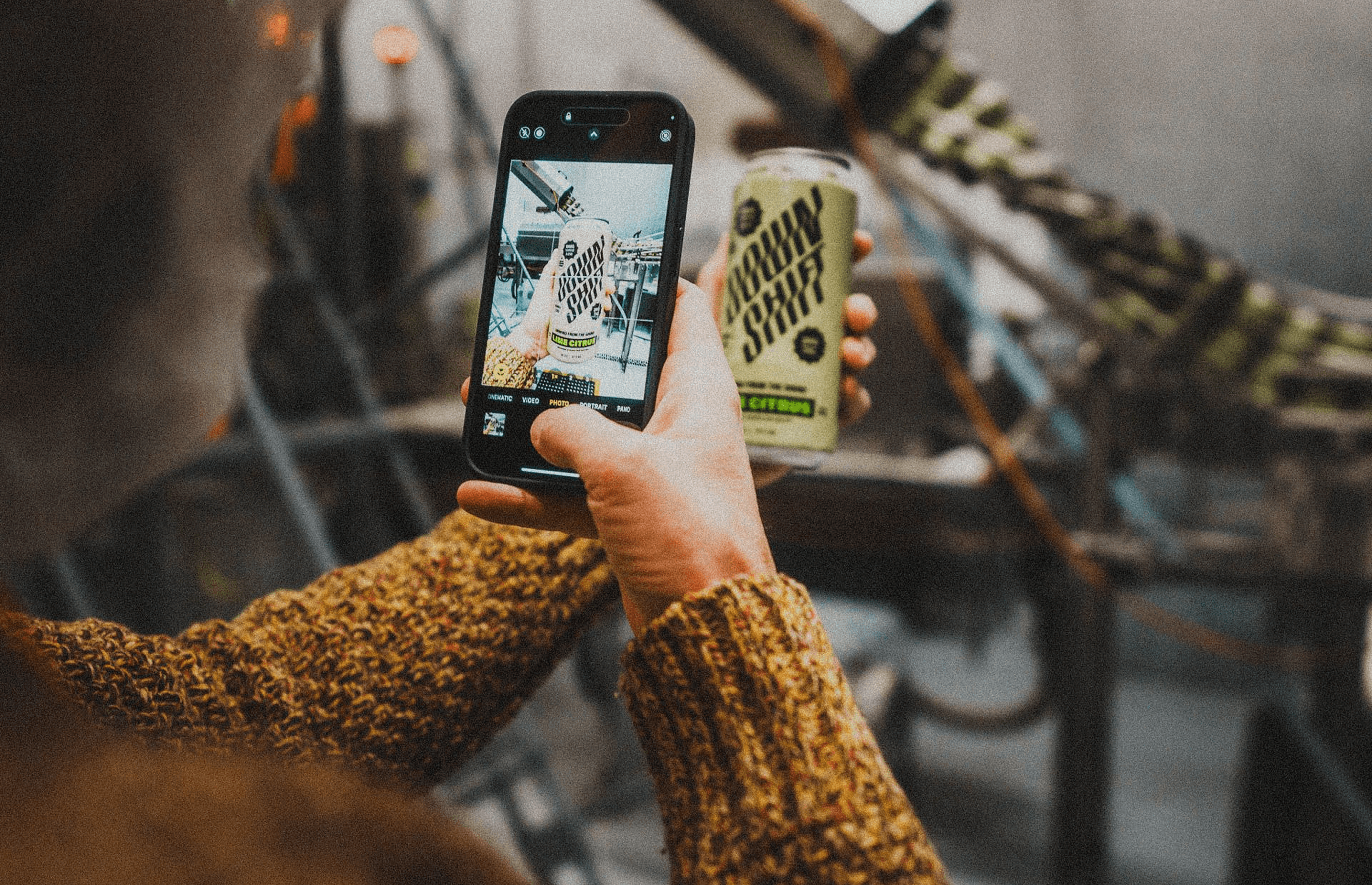
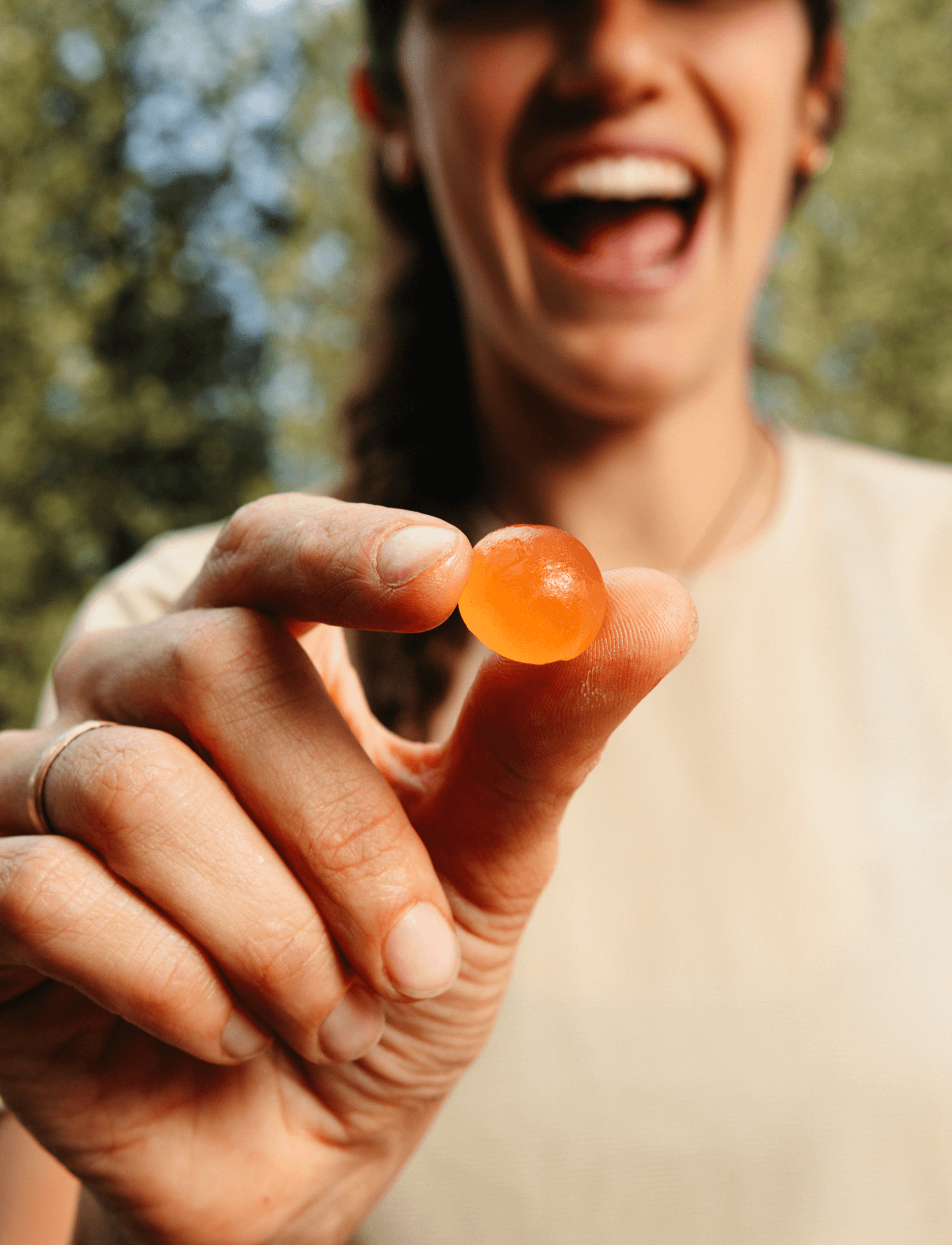
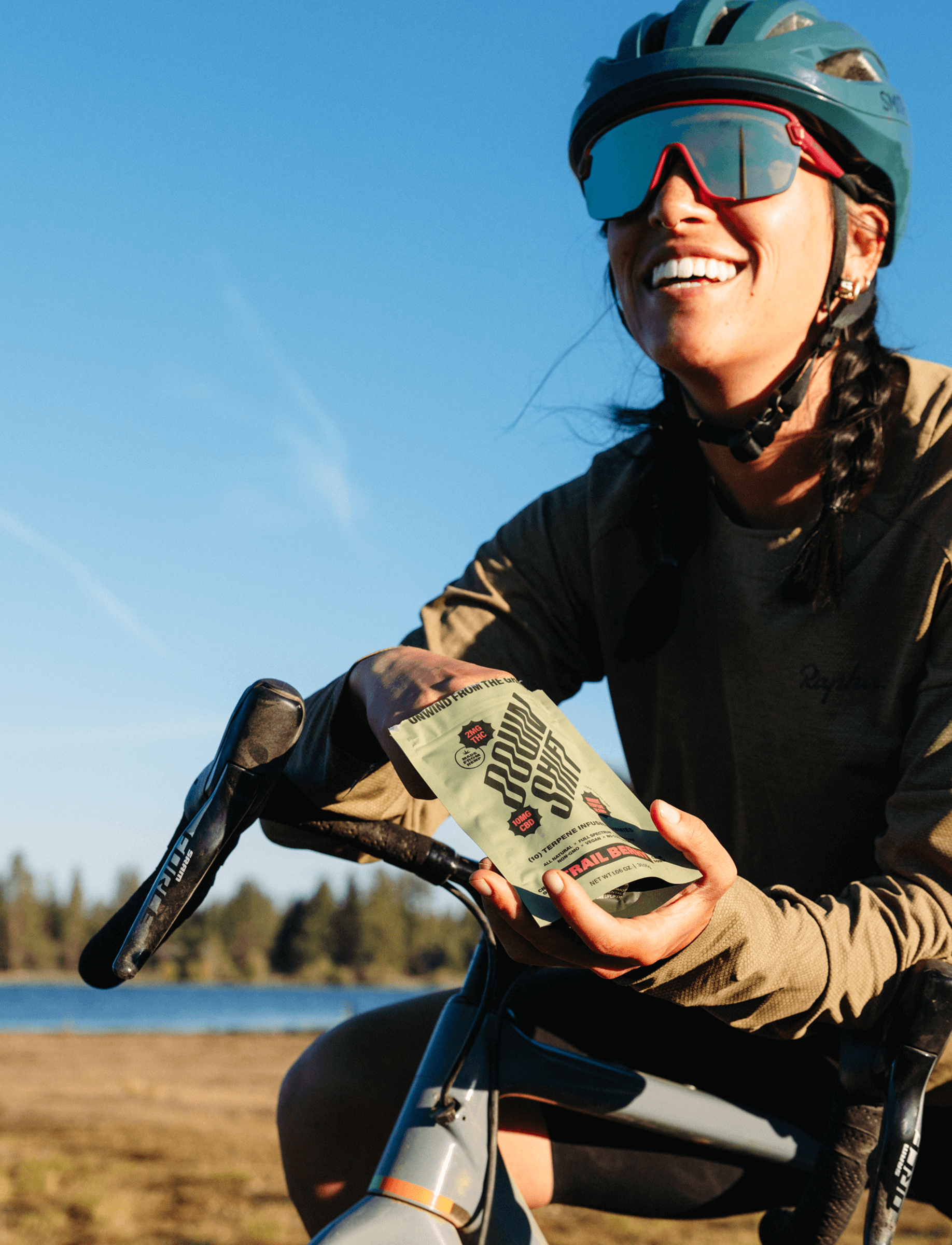
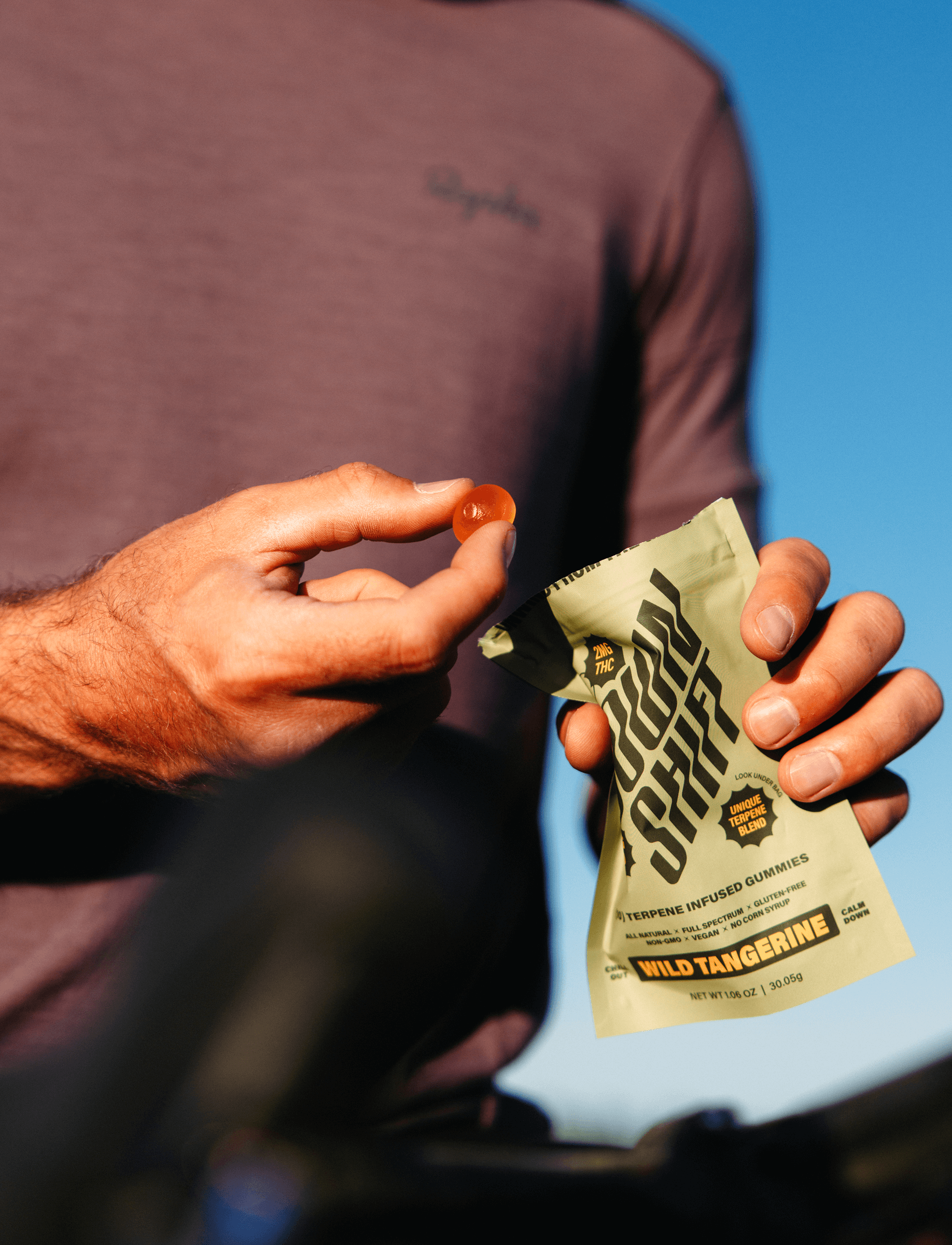
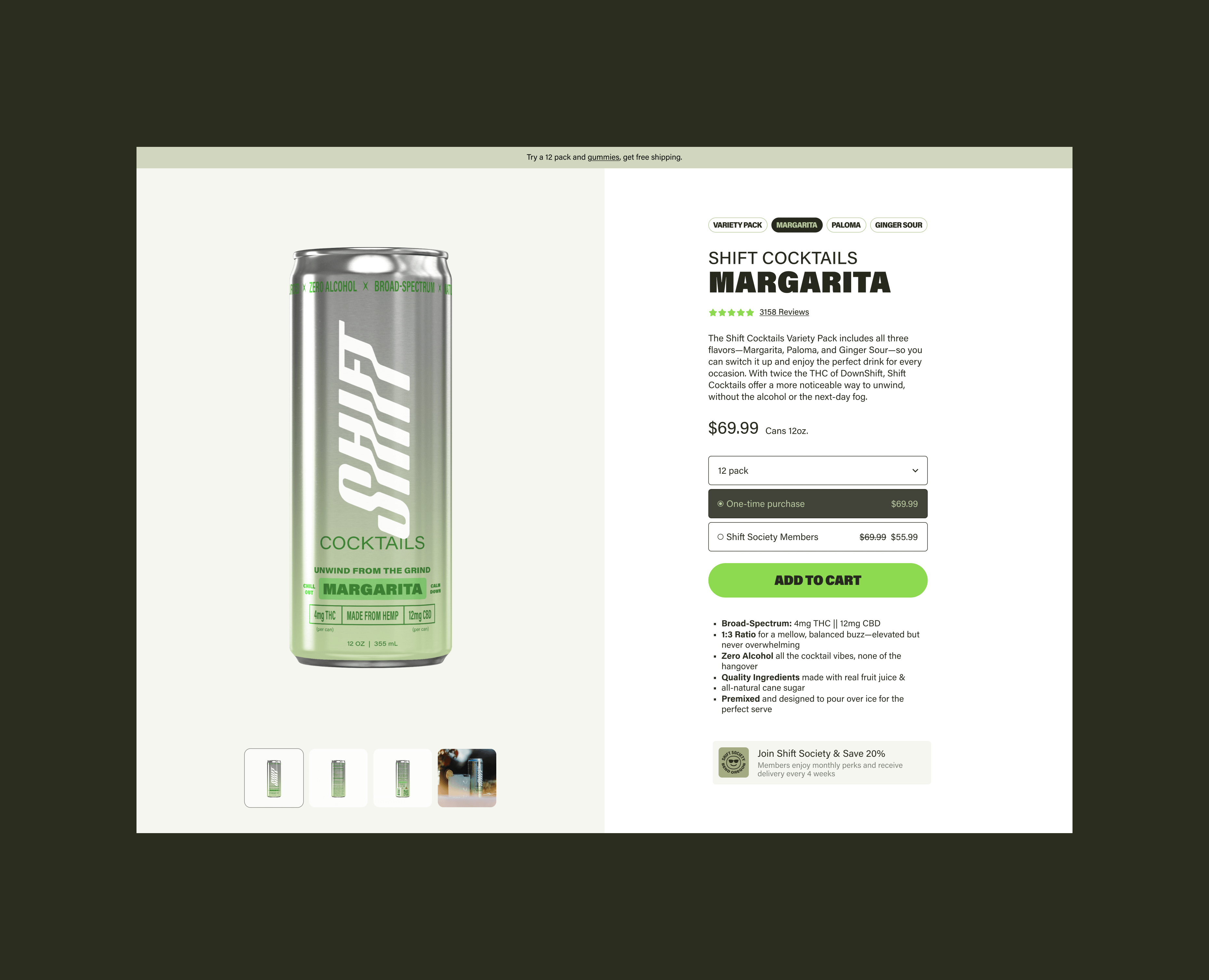
Down Shift is a cannabis-infused sparkling water company producing CPG beverages, gummies, and more made with 100% hemp. As the cannabis beverage market rapidly expands, the brand needed a distinctive identity that could stand apart from a sea of sterile health-drink competitors and overly psychedelic cannabis brands. They approached us to create a holistic brand and packaging system—logo, responsive brand platform, packaging across all SKUs, content and more—that would capture the essence of nature, adventure, and balance, while appealing to both seasoned cannabis users and wellness-minded newcomers.
Our discovery process began with a category audit of cannabis beverages, sparkling waters, and outdoor lifestyle brands. We found the market divided between clinical minimalism and loud, gimmick-driven design. Down Shift had an opportunity to own a more authentic space—rooted in the natural world and inspired by outdoor sports culture. Our goal was to create a system that felt premium and refreshing, while still approachable on shelf and credible in a wellness-driven CPG context.
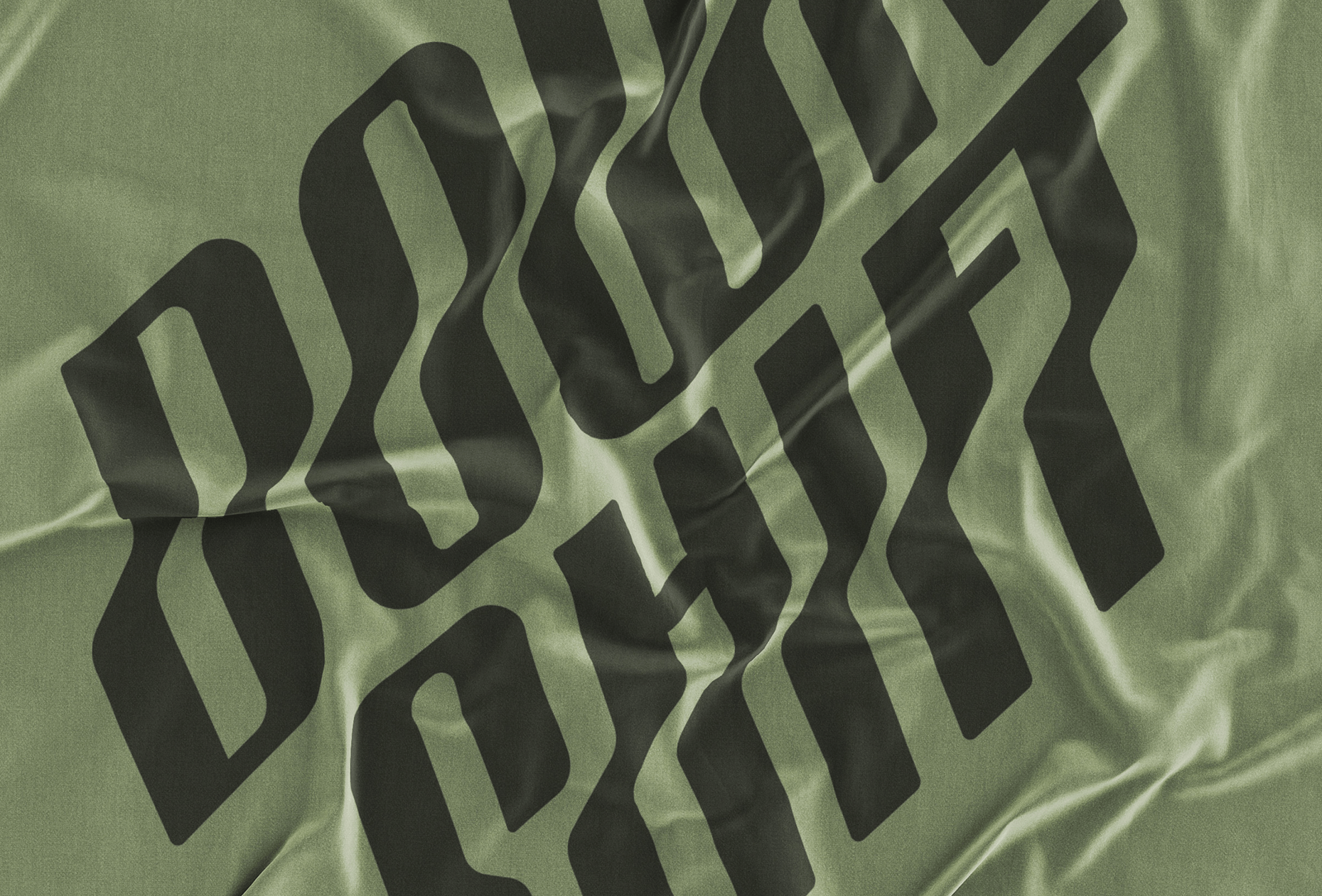
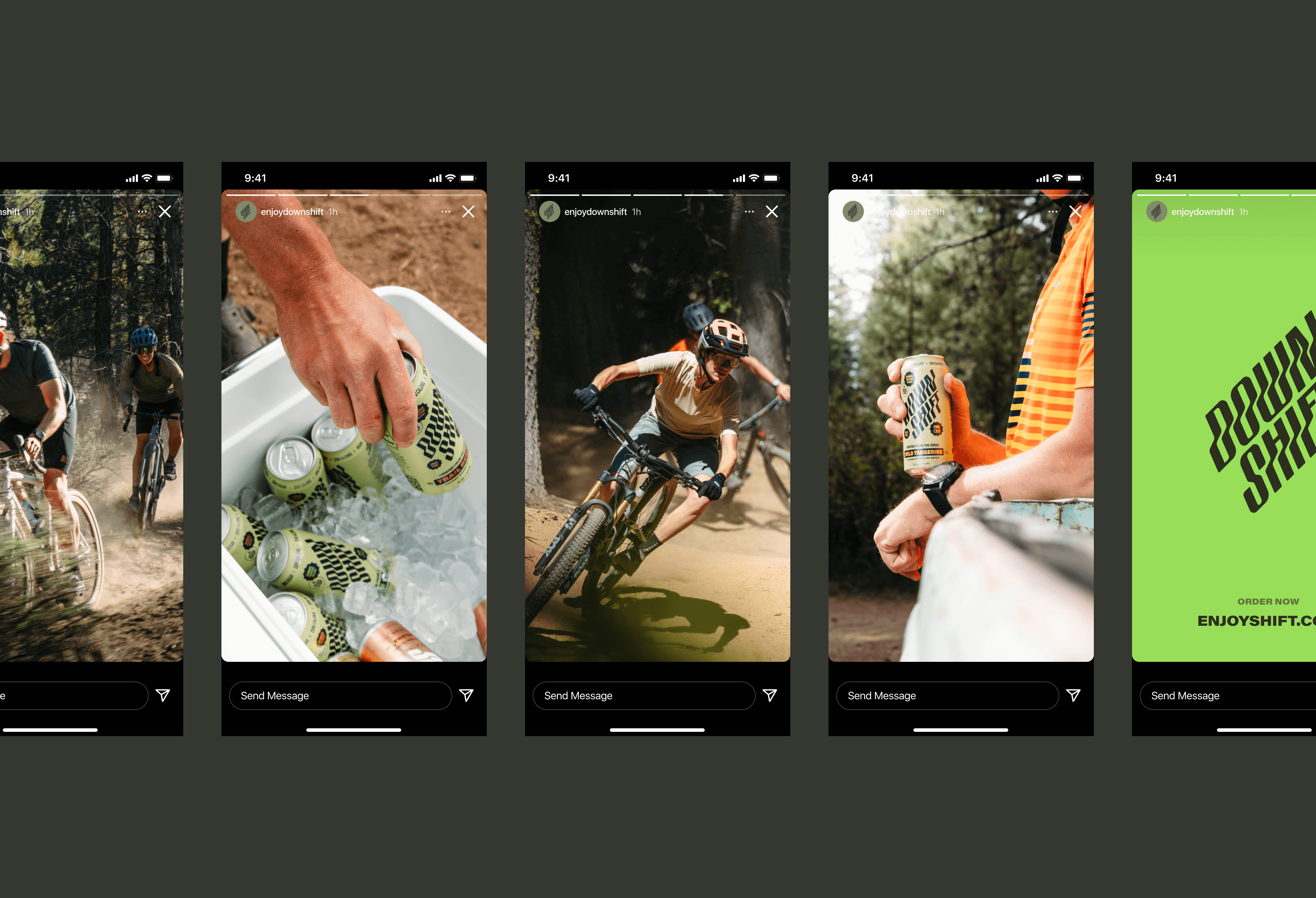
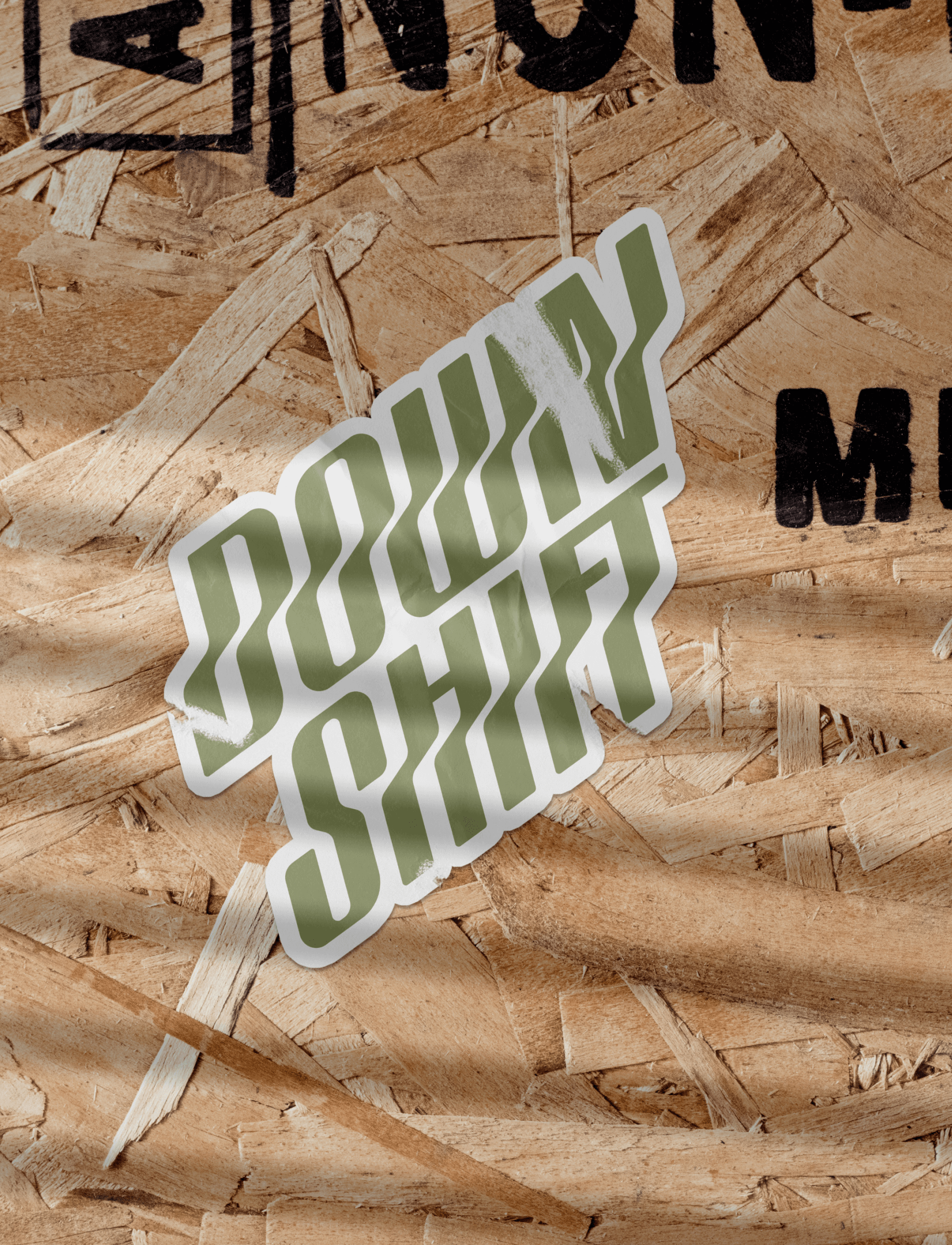
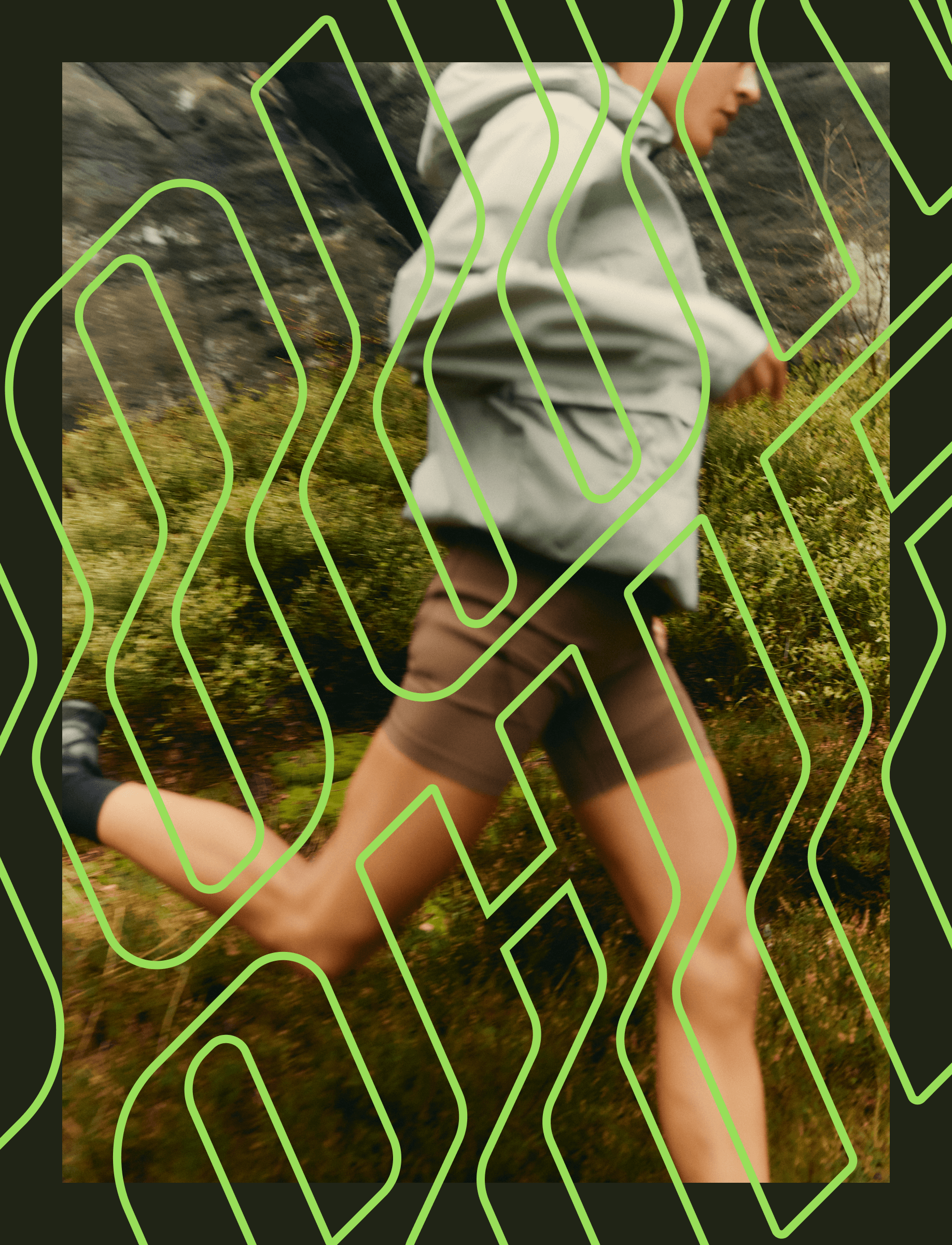
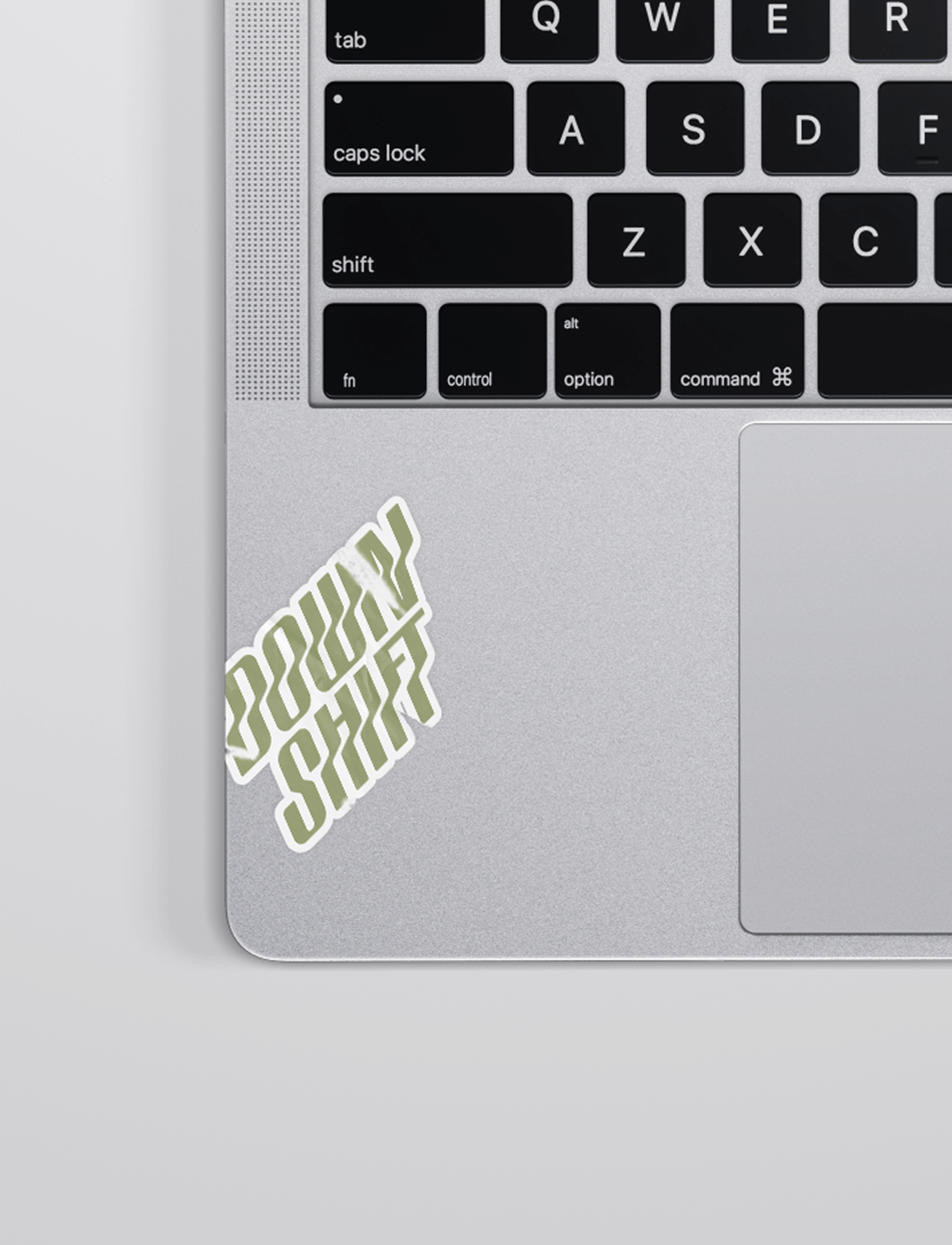
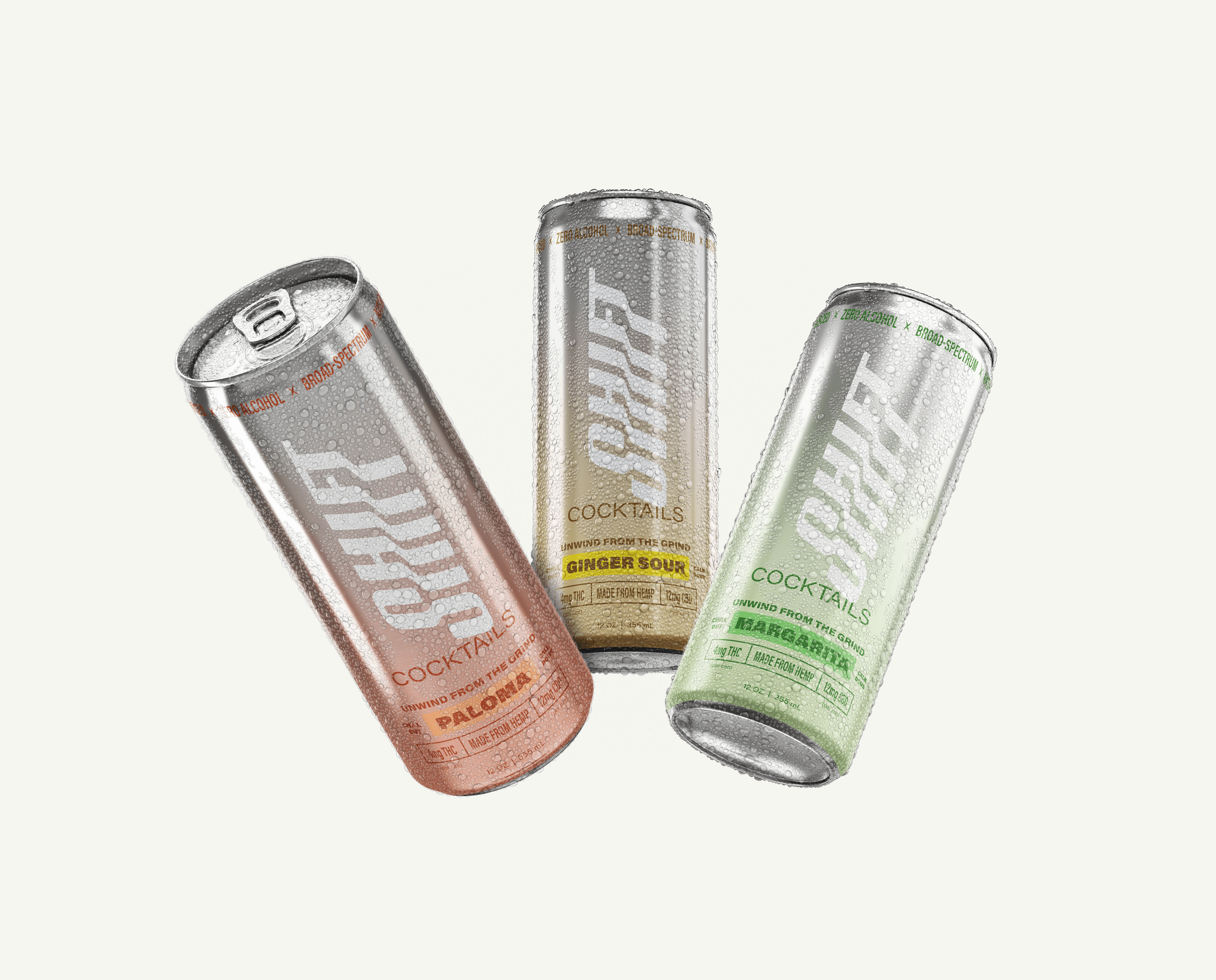
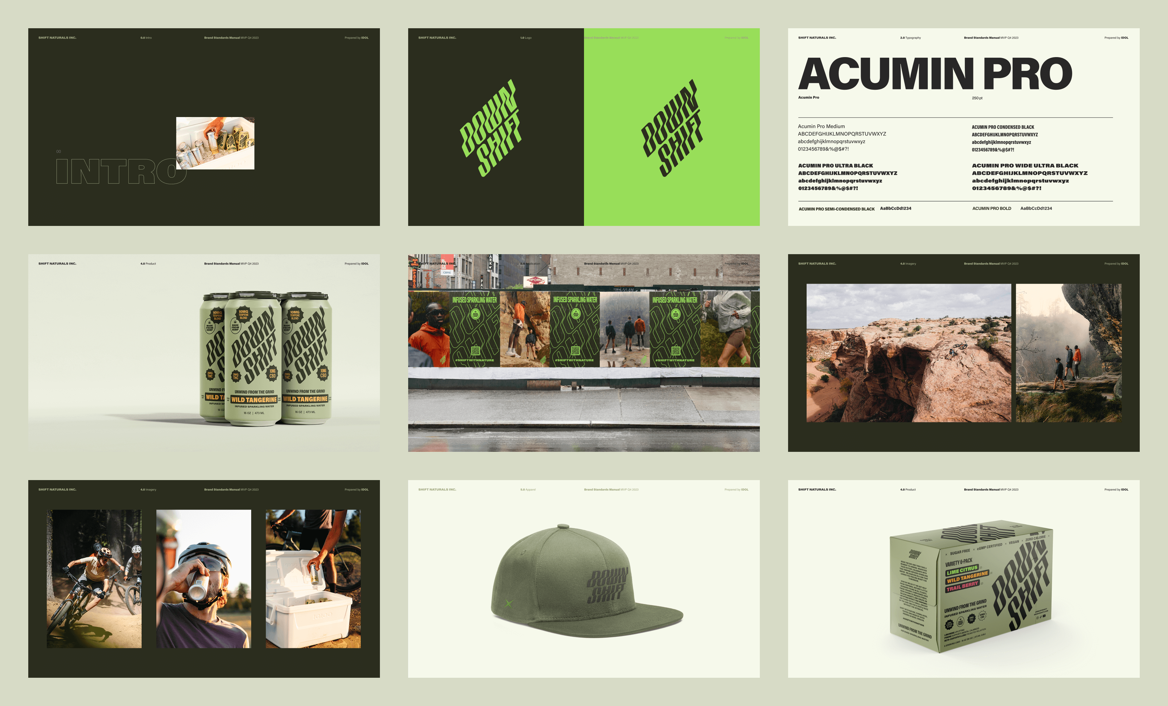
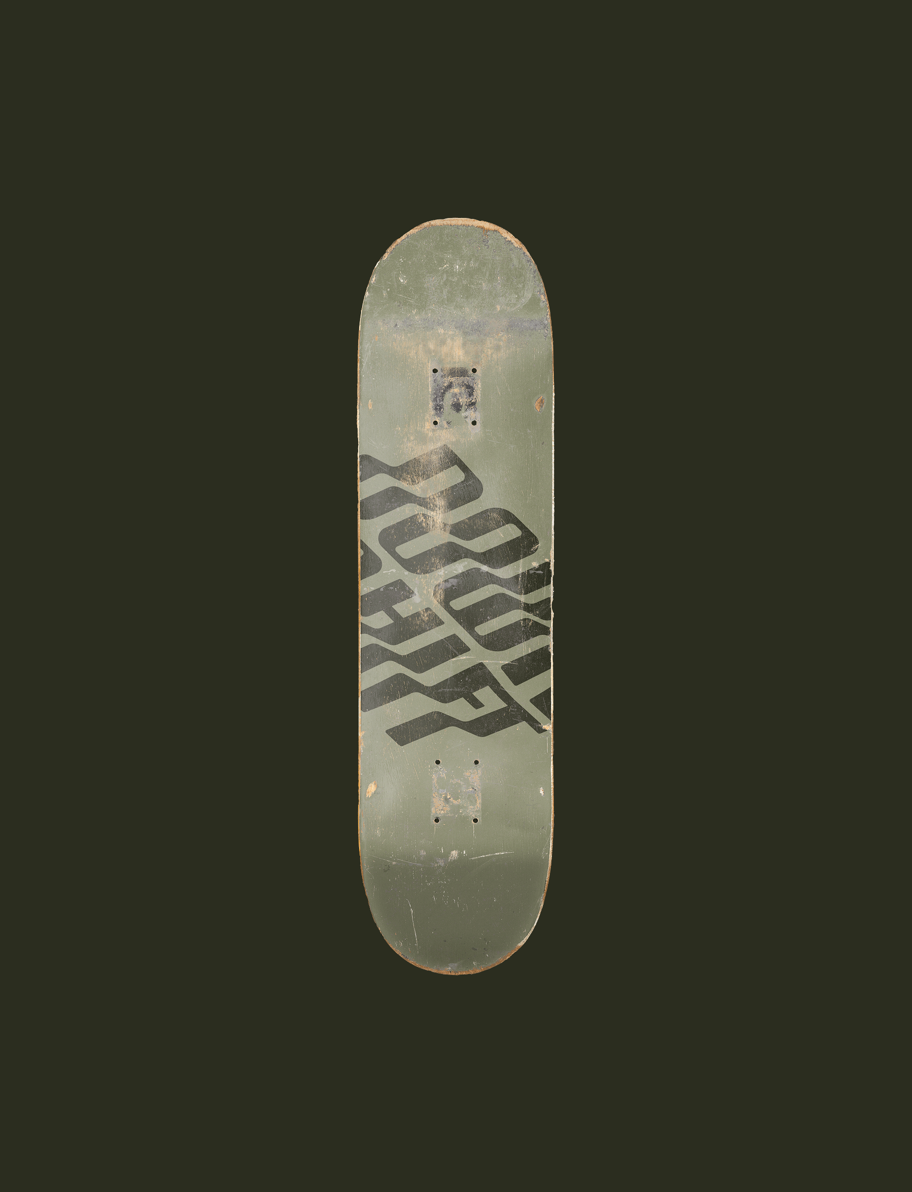
We designed a logo and visual identity system that expressed movement and balance, evoking the feeling of shifting gears into a more relaxed state. The identity was built to be responsive and flexible, working seamlessly across packaging, digital channels, and merchandising. This approach gave Down Shift a scalable brand system that could grow alongside its expanding product line and retail footprint.
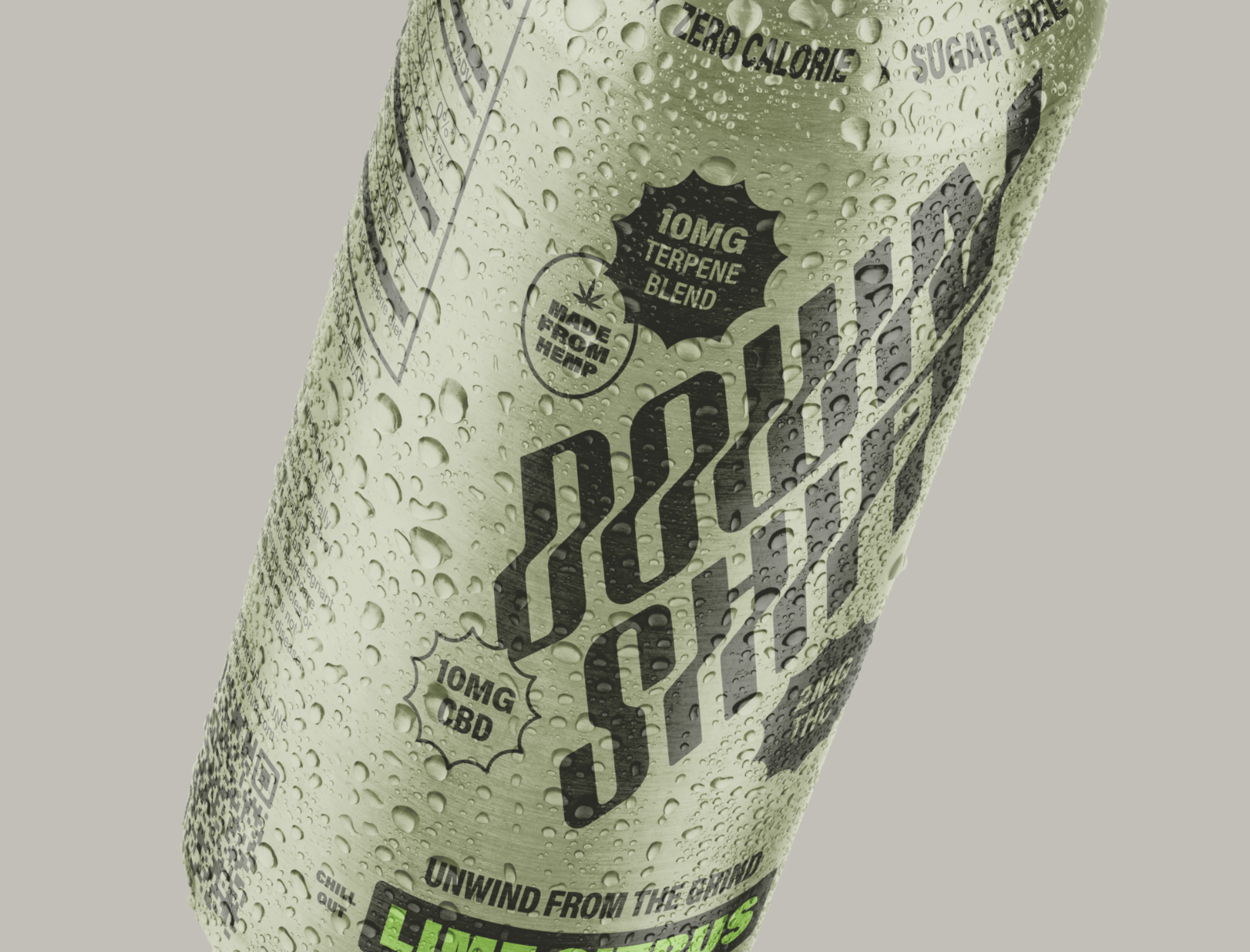
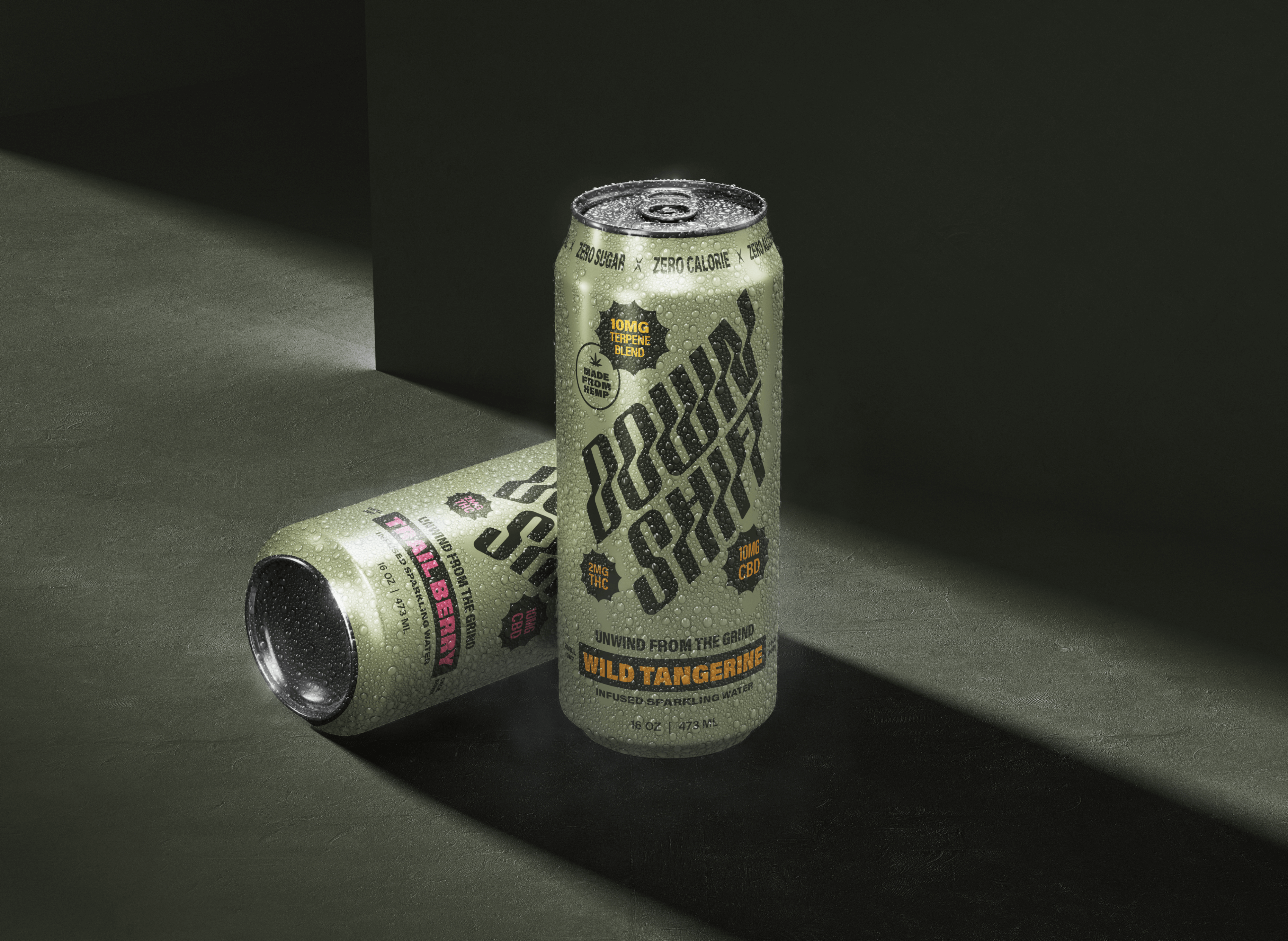
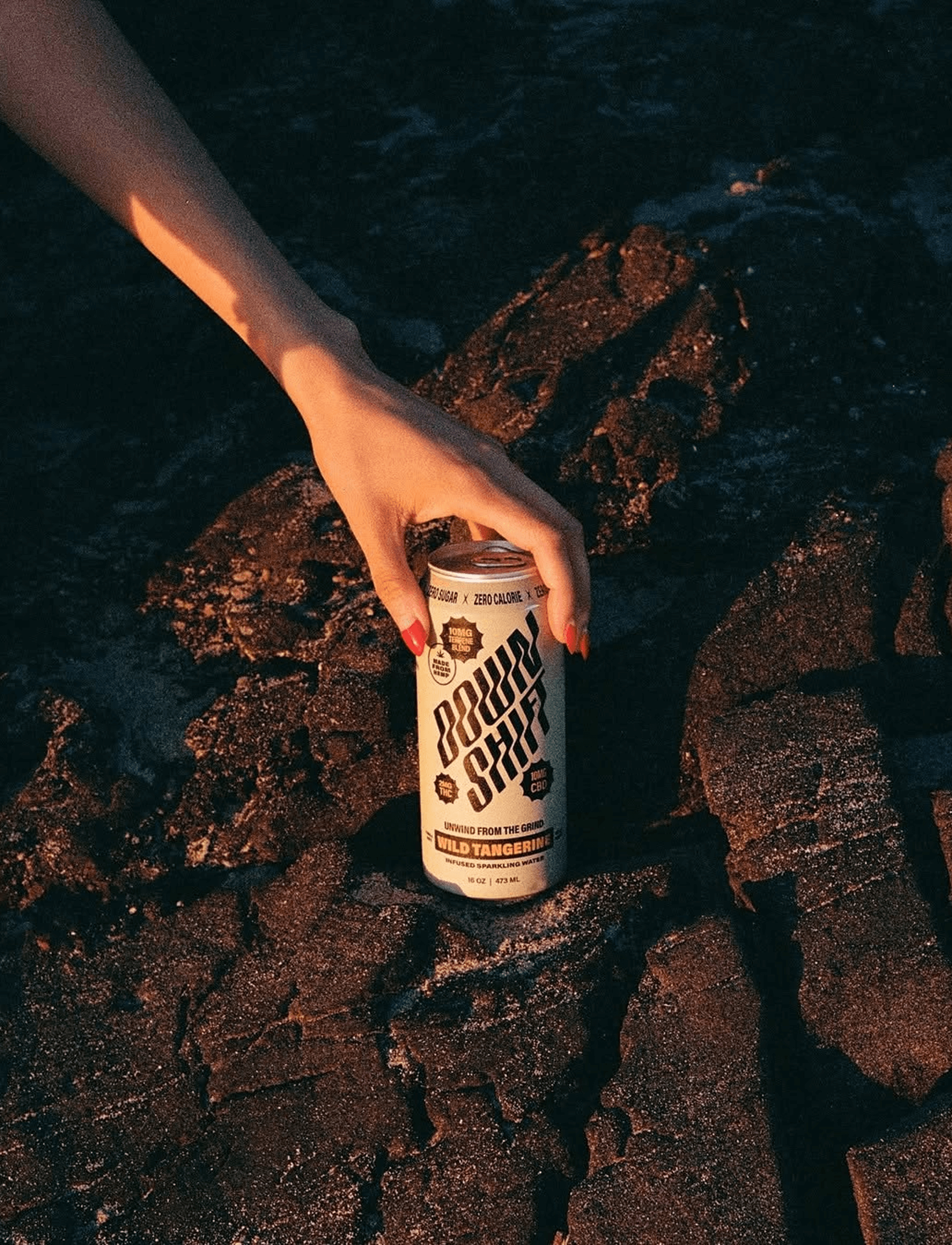
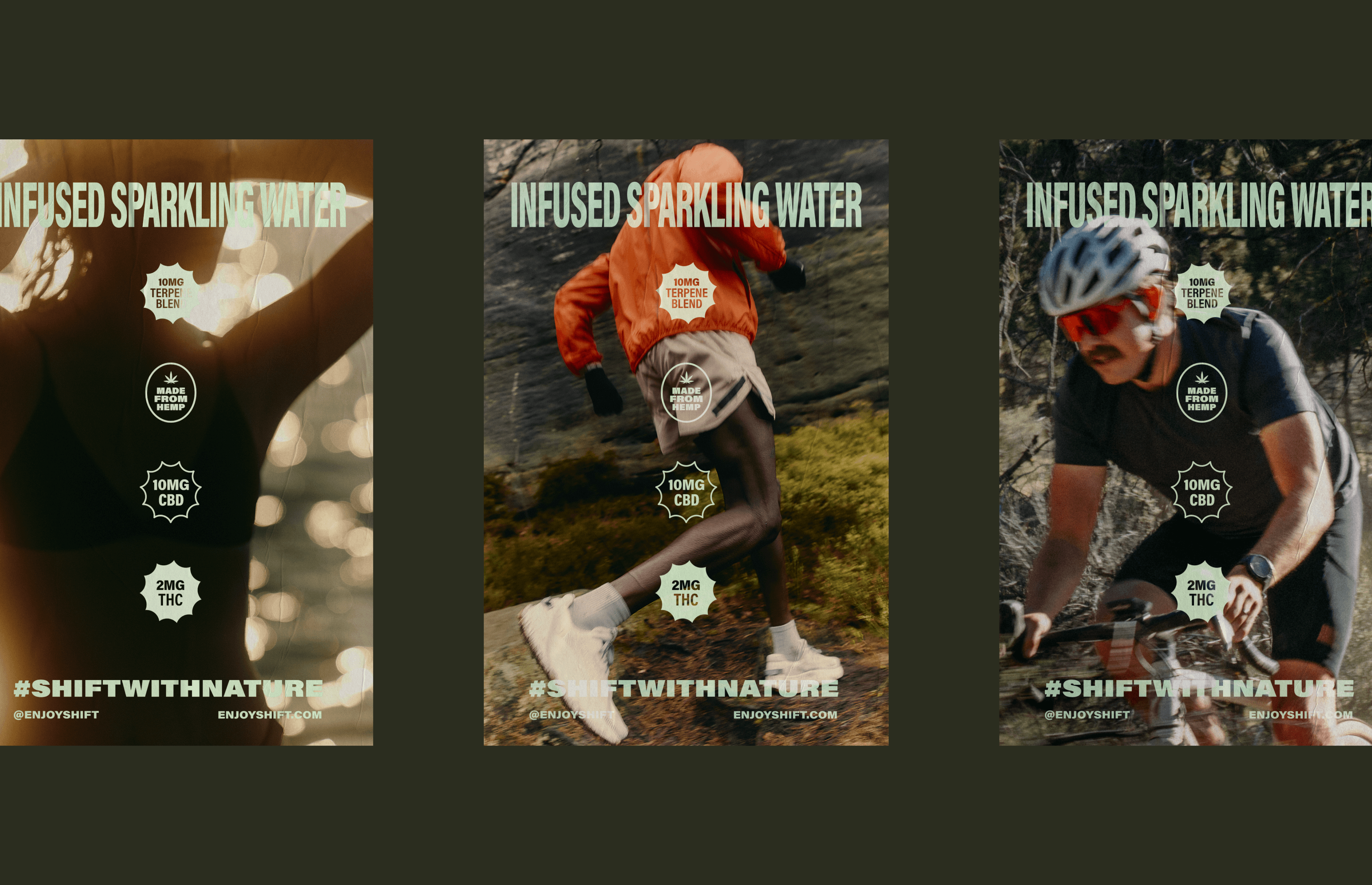
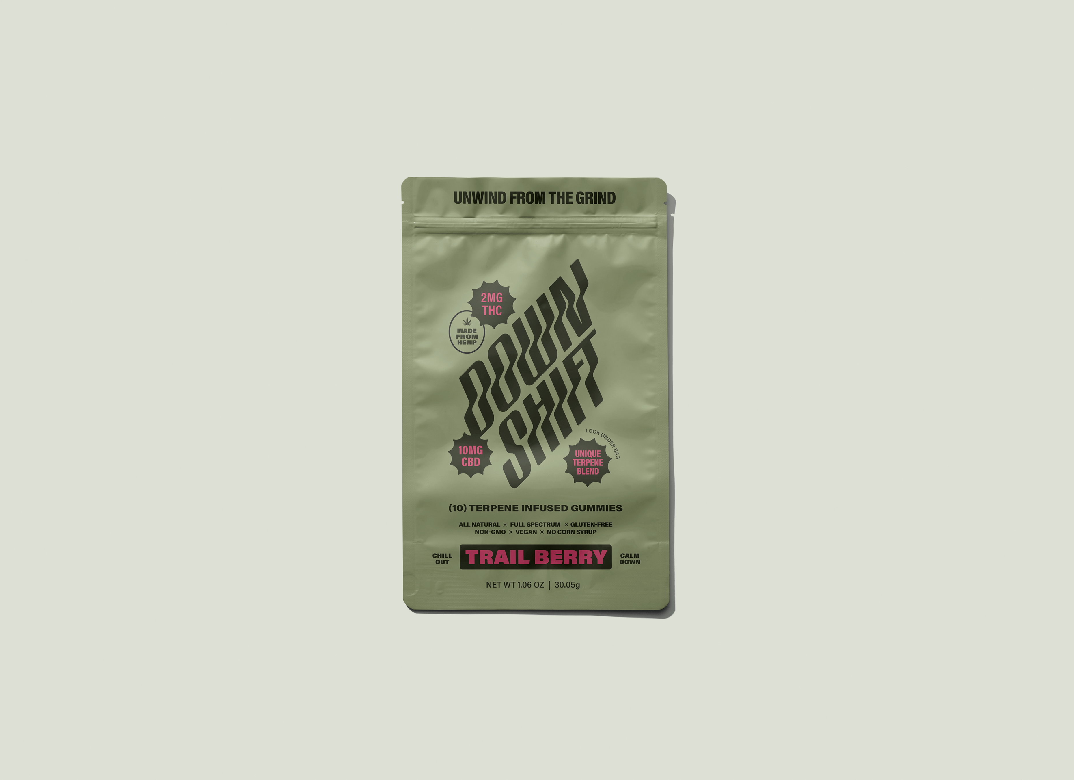
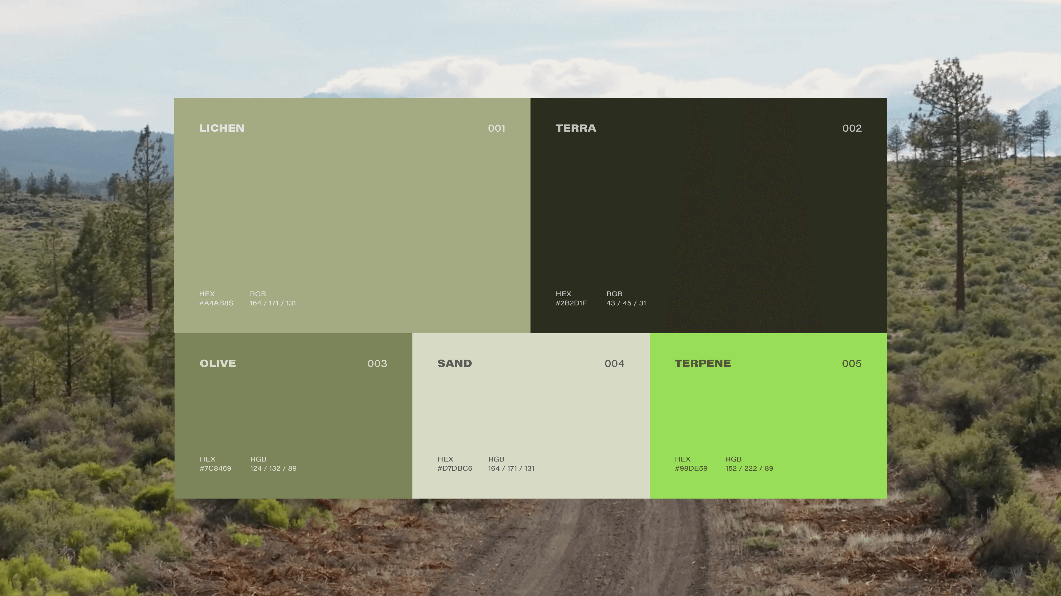
Color and typography became the backbone of differentiation. The dynamic product system leveraged nature-derived palettes tied to flavor and SKU—earthy greens, mountain blues, and sunset oranges—that helped consumers intuitively navigate the line while reinforcing the brand’s outdoors DNA. A clean, hierarchy-driven typographic system brought structure and clarity, ensuring legibility in crowded retail environments and providing consistency across all brand communications.
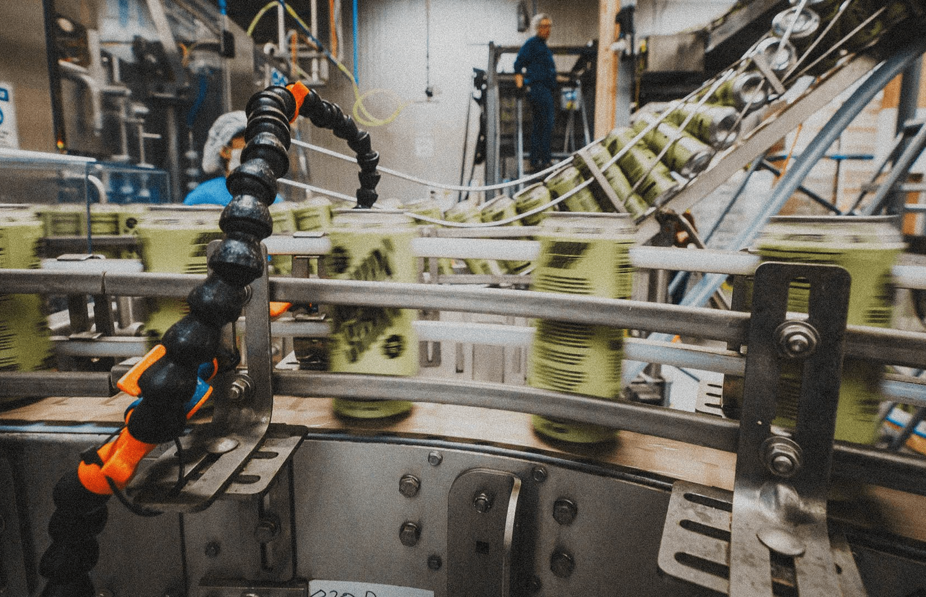
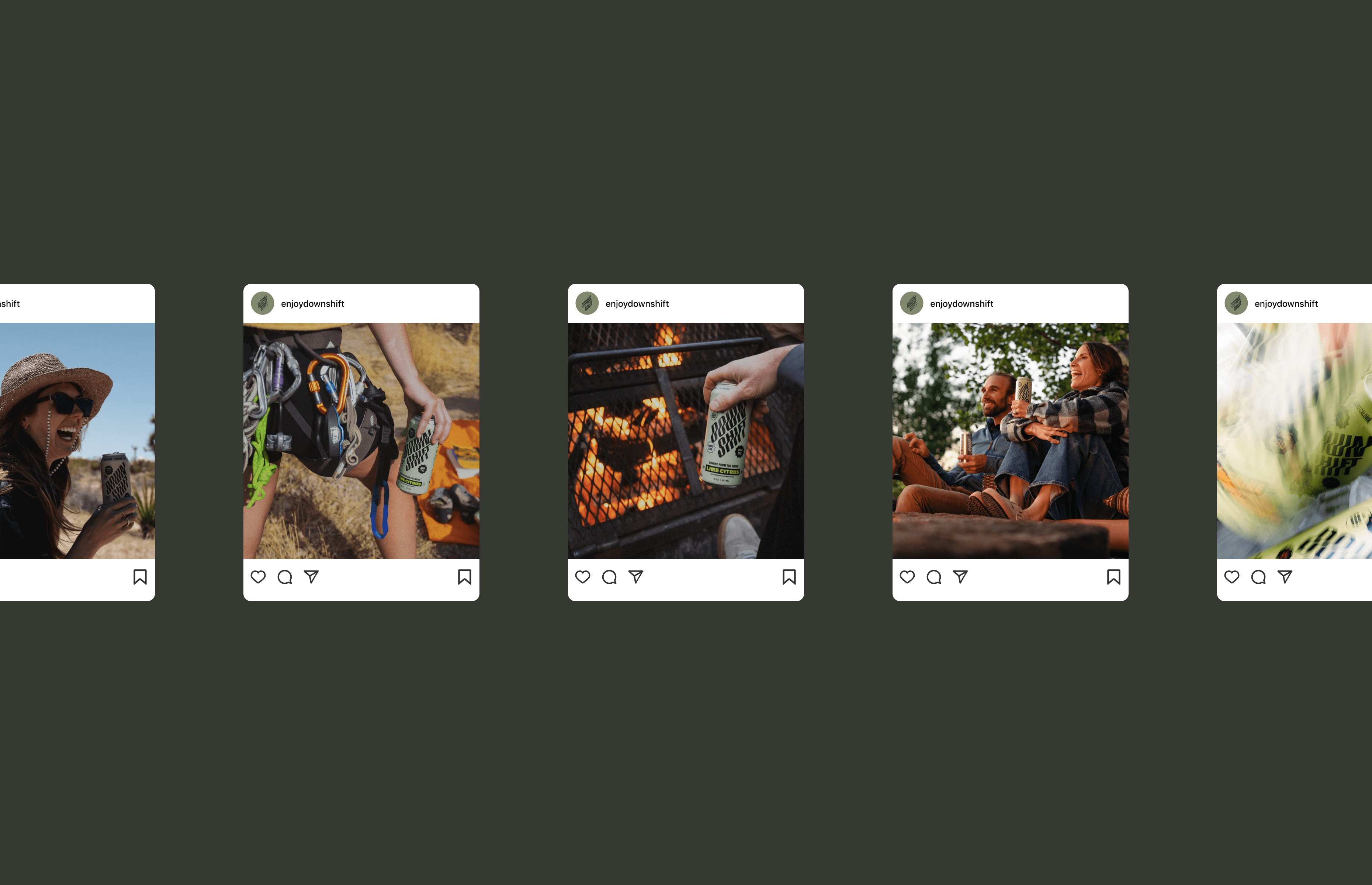
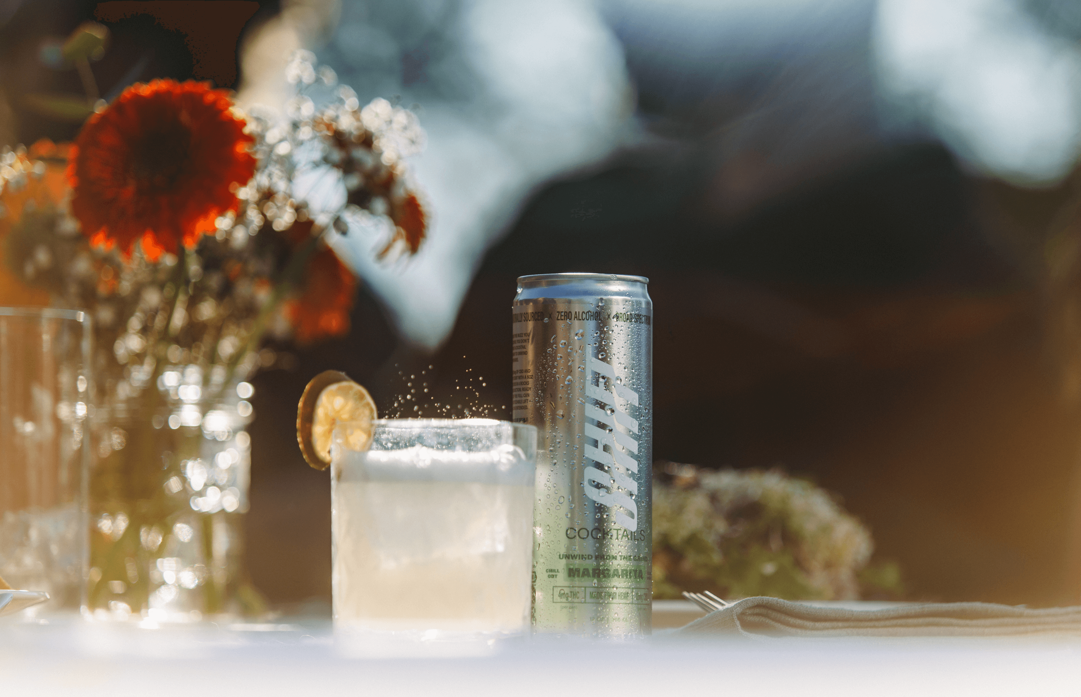
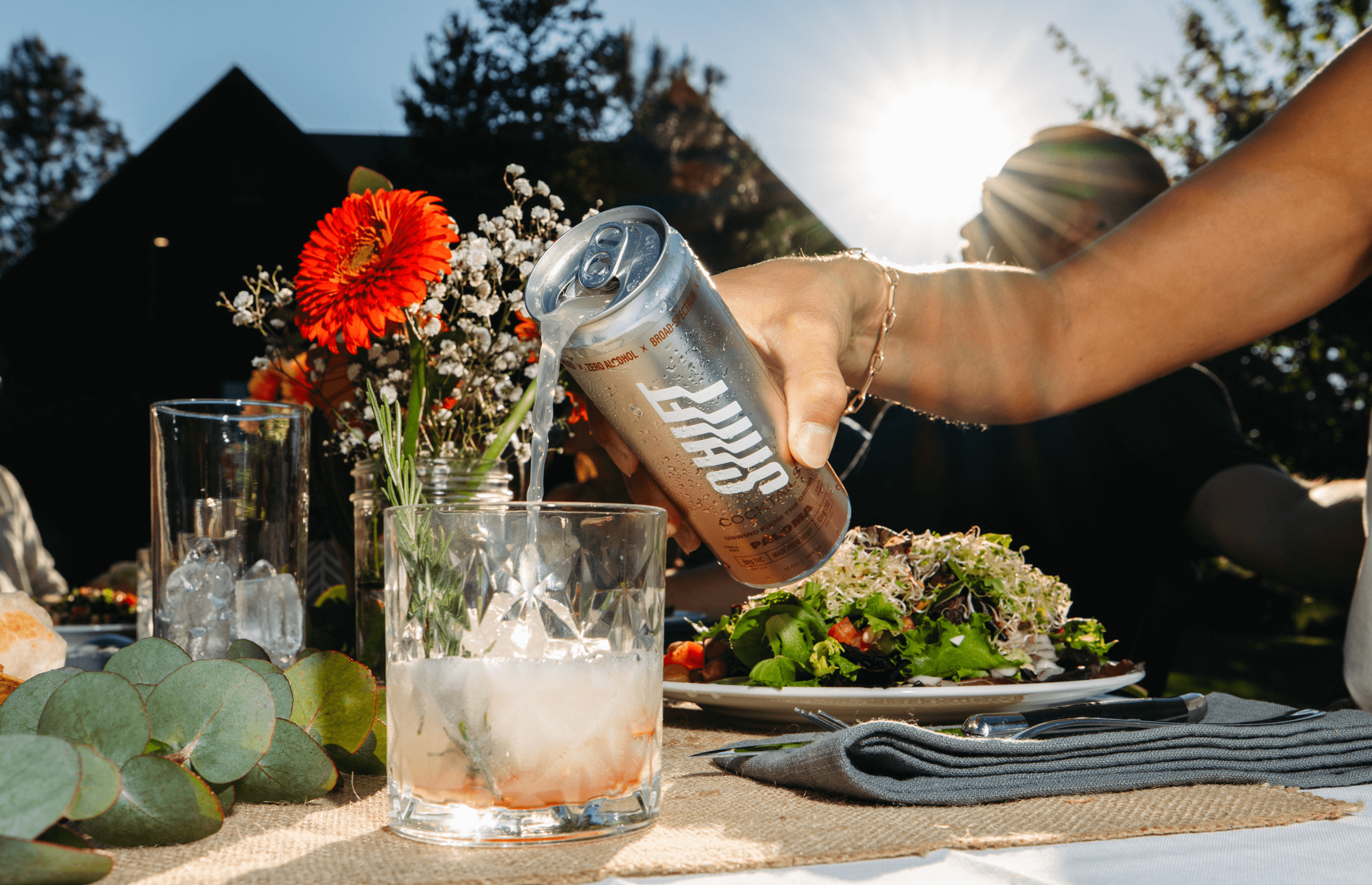
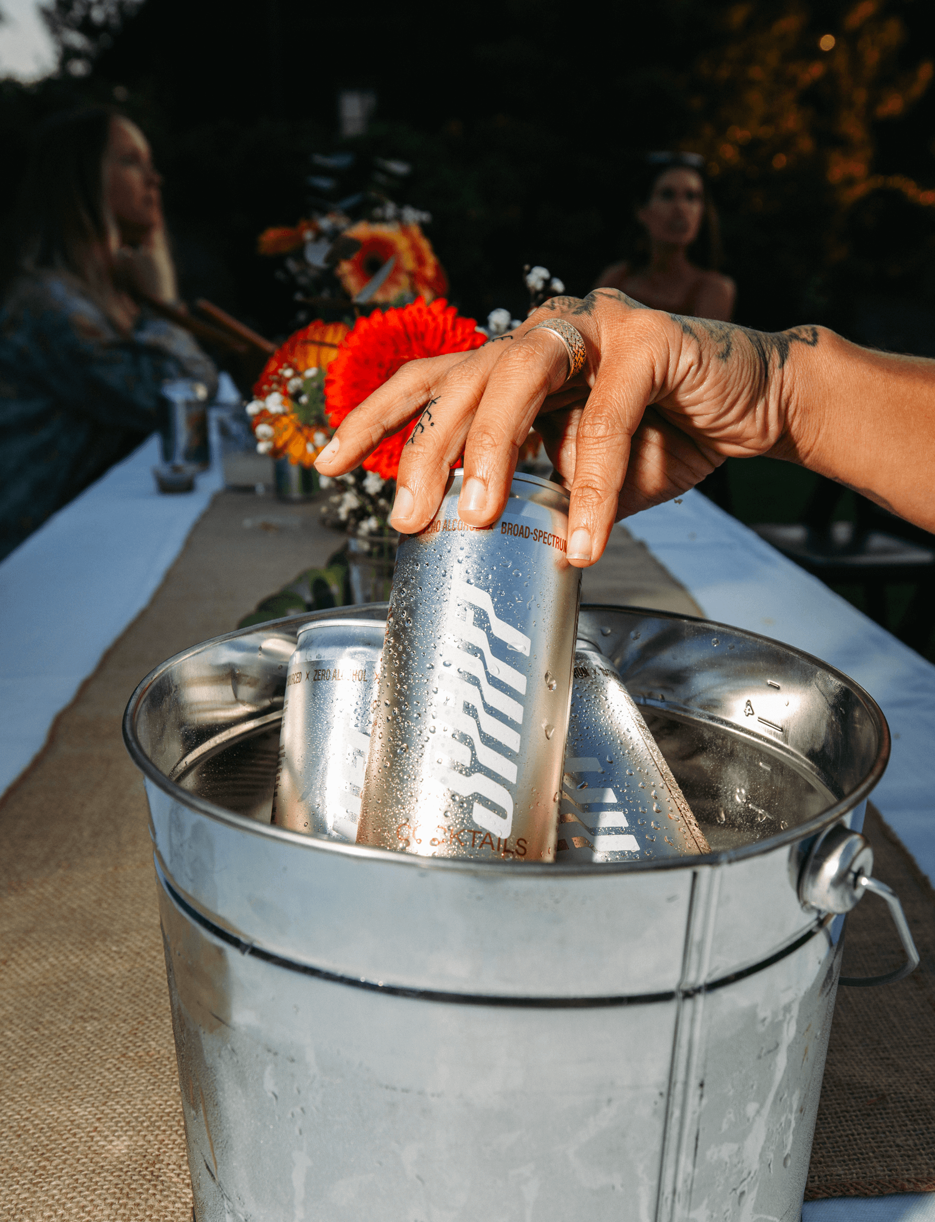
Packaging was designed with shelf impact and systemization in mind. Each can was treated as both a standalone product and part of a broader visual family, creating cohesion while giving each flavor its own identity. Simple, nature-inspired layouts paired with bold typography gave Down Shift a modern yet grounded look. The result was packaging that felt both refreshing and adventurous—positioning the brand as the go-to cannabis beverage for active, wellness-oriented consumers.
The final brand and packaging system positioned Down Shift to compete with leading CPG beverage brands while carving out a distinct niche in cannabis-infused wellness. By blending the ethos of outdoor sports with the purity of natural design, we created an identity that feels timeless, scalable, and instantly recognizable in a crowded space.
Results
Shelf Differentiation: Down Shift launched with packaging that stood out in dispensaries and retail, driving strong consumer trial and recognition.
Scalable Brand System: A flexible identity and SKU system designed to accommodate rapid product expansion across flavors and new product formats.
Market Positioning: Successfully positioned Down Shift as a cannabis CPG brand with the polish of a premium outdoor lifestyle company, setting the stage for national distribution.
Clients
Ryan Evans and Chris Stuckey